How do we know pupils are making progress? Part 3: Assessment
Mar 26, 2019
In Part 1 of this series I set out the problems with making predictions about students’ progress by drawing a ‘flight path’ between KS2 and KS4, then, in Part 2, I explained how thinking about the curriculum as a progression model is essential in making judgments about whether students are making progress. In this post we will turn our attention to issues of assessment. NB. This might feel a bit technical at times, but please know that I'm trying hard to explain complex ideas as simply as I'm able. 
It's important to note that assessment can have a range of purposes. You might want to help students consolidate their knowledge of a concept; diagnose what they already know before commencing a sequence of instruction; seeking to discriminate between students' relative grasp of the concepts covered; or intending to make a summative statement about how well a student has learned a topic. Each of these various purposes have their uses but here I intend only to focus on issues of measurement and inference. That is, how we can use assessment to determine students' progress through the curriculum and what we can reasonably say they know and can do at a particular point in time.
As we saw in Part 1, too many schools rely on a flawed model of progression based on cohort level estimates of what grade a student is most likely to achieve in their GCSEs based on their performance in maths and English at KS2. This might estimate, for instance, that a students who achieves x in their SATs has a 34% chance of attaining y. Although this estimation clearly implies that a student has a 66% probability of ending up with some other grade, y, having the highest probability, is given as that student's target grade and line is drawn between their KS2 performance and this spurious target grade. Assessment then becomes the dark art of trying to determine whether this student is where the 'flight path' predicts they should be.
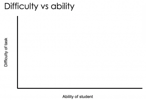 There are several problems with this, but perhaps the biggest is that we fail to take into account the difficulty of the test. Typically, we just see a test as a mechanism for measuring students' ability, or level of development, and fail to understand that getting 50% in a harder test might actually be better than getting 70% in an easier test. But we should also understand that if one student gets 70% and another gets 35% on the same test, that does not mean the first student has done twice as well as the second student. It should be obvious that getting less than 35% is far easier than getting more than 35% and, if a test is well designed, items will get progressively more difficult so as to better measure individual students' performance. If all students get 100% then the test is useless: you have no idea of students' progress and can say nothing about their attainment. The same would, of course, be true if every student failed to get any marks at all. Ideally, a test will attempt to assess a spread of ability in order to see if the students with the most ability (or those who have developed the most) are able to answer harder items but will also allow us to measure the progress of the least able (or those students who have shown the least development) by having a wide enough spread of easier to answer questions.The big question is, how do we know which are the most difficult question? The answer is surprisingly simple: you have to analyse students' attainment at the level of items to see which questions they go right and which they got wrong.
Let's start by looking at a typical data summary in Table 1:
[caption id="attachment_67369" align="aligncenter" width="1024"]
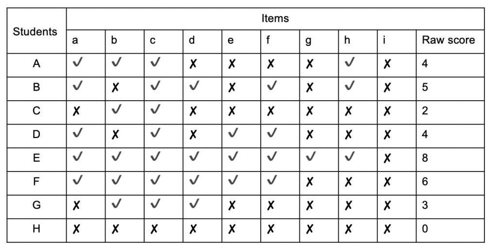 Table 1 - Summary of test data[/caption]
Here we can see the performance of 8 students (A - H) in a test of 9 items (a - i). By totting up how many items each student answered correctly we can see that Student E did best with 8 correct answers and student H did worst with no correct answers. In order to find a signal amidst this noise it helps to reorder the test data in a scalogram:
[caption id="attachment_67370" align="aligncenter" width="1024"]
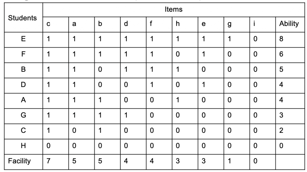 Table 2 - scalogram ranking student ability and item difficulty[/caption]
By looking at this we can now see that students found item c the easiest, with 8 correct answers and item i the hardest with no correct answers. We also establish that we can learn very little from Student H's test performance from this data set alone. It may be that they were unable to answer any of the questions but, equally, it could be that they couldn't be bothered, we just can't tell. Back in the real world we might have all sorts of relevant knowledge about H, but none of that helps us to work out anything about item difficulty, so the best bet is to exclude H's results from our analysis. Likewise, there's little we can learn about the difficulty of item i. It could be that the questions so was tricky that none of the students were able to answer it, but it could also be that it represents part of the curriculum that has not yet been covered. If the same question was asked after a relevant teaching sequence, we might find that some, or all, of the students were able to answer it correctly, so again, we ought to exclude it from our analysis.
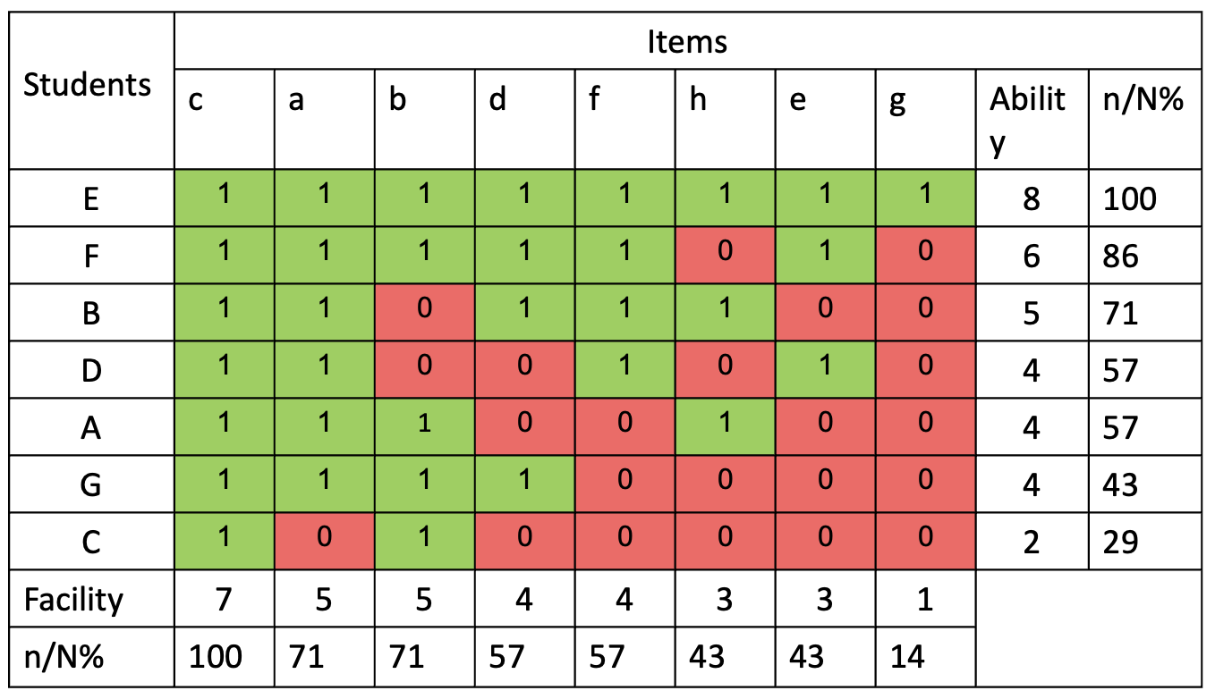 Having excluded student H and item i, Table 3 allows to think about not only how each student has performed, but also to think about which items they got wrong. As with the previous scalogram, we learn little from examining the performance of student E or by looking at who answered item c correctly, but beyond that, a general pattern begins to emerge. We can say, with some confidence that items g, e and h are more difficult than items a, b, d or f. We can also claim that students E, F and B are, at least on the topic covered by this assessment, more able than D, A, G or C. (Obviously, the sample in this made up data is far too small to actually make any such claims with much degree of confidence, but the greater the number of students and the more test items answered, our confidence can grow.)
What can be particularly interesting is to ponder the anomalies. Few students will demonstrate the predictable test performance of student G who's manage to get the 4 easiest questions right, but failed to answer the 4 hardest questions. Students will regularly deviate from predictable patterns, but this gives us the opportunity to think about why. The fact that C got a wrong is not that great a surprise; we should, perhaps be more interested that they got b right. As we'll see, the likelihood of a student getting any answer right is probabilistic. What's more interesting is that A got item h correct, and that B got b wrong. Also, student D's performance is interesting: why did they fail to answer items b and d when they were able to answer item e? This might be explained by absence or inattention, or it could be that they've failed to master a foundational concept that other students of similar ability have no trouble with. It's even more interesting to consider why both D and B got item b wrong. Could this perhaps tell us that there's something flawed in the way this particular item is posed? For instance, if this were a maths test, maybe item b is a badly expressed word problem that has confused students despite being conceptually straightforward? Asking the question allows us to go back to our test and see if the problem is with the item (in which case we should reword or remove it from future tests) or with the students' understanding (in which case we should consider how to adapt our teaching.) Thinking in this way is a relatively quick and easy way to improve the reliability of our assessments and the validity of the inferences we can draw about students' attainment. But what about progress? How can we tell if students are mastering the curriculum?
A single assessment tells you nothing about progress. To make any kind of meaningful statement about students' journey through the curriculum we need to be able to calculate their performance from test to test. And to do this we need to consider the relative merits of the number systems that are available to us. Back in 1946, psychologist Stanley Stevens proposed four scales of measurement which he called nominal, ordinal, interval and ratio.
[caption id="attachment_67372" align="aligncenter" width="1024"]
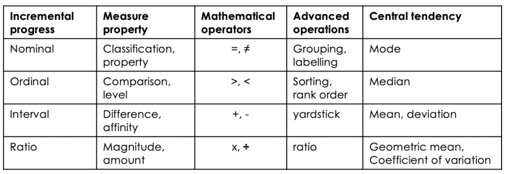 Table 4: Stevens' level of measurement[/caption]
Nominal measurement is simply a means of determining whether a thing is a member of a group. Nominal measurement would include dividing students into boys and girls and pupil premium and non pupil premium. All we're able to calculate is the most frequently occurring type. Ordinal measurement allows us to compare two things and judge which is x > y? (none/some/more/all). This is how judging using a comparative judgement algorithm works (more on that later). Interval measure allow us to work out where something is along a scale and establish the degree of difference between x and y. For instance, the Celsius temperature scale is divided into regular intervals between the freezing point of water (0°C) and its boiling point (100°C.) However, ratios are not meaningful as the zero point of the scale is arbitrary so that it's impossible to state that 40°C is twice as hot as 20°C. By the same token, neither is it possible to say that a student who scores 60% in a test has done twice as well as a students who scores 30%.
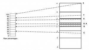
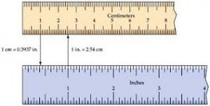
It's only with a ratio scale are the differences between measurements becomes meaningful. For example, it we want to know whether one object is twice as hot as another we need to measure temperature using the Kelvin scale which as a meaningful zero point. The point of a ratio scale is to be able to measure performance on two different test but to convert the two different scales of item difficulty into one scale where the difference between performance is on the same scale.
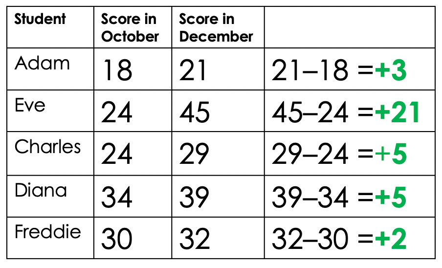
The bottom line is this: if you're not using a ratio scale you cannot make meaningful or defensible claims about students progress or attainment. We can see the problem by analysing the performance of 5 made up students on two different texts
[caption id="attachment_67377" align="aligncenter" width="904"]
 Adapted from Deep Ghataura's researchED talk, Fundamental Measurement for Schools[/caption]
All five students took a test in October and then a second test two months later. When we subtract the first test score from the second we can see how much progress each individual student has made. Although Eve is clearly out performing her classmates by a considerable margin, all have seen their scores increase so we can be quietly confident that all have made progress. But what happens if we turn the students' raw marks into percentages?
[caption id="attachment_67378" align="aligncenter" width="1024"]
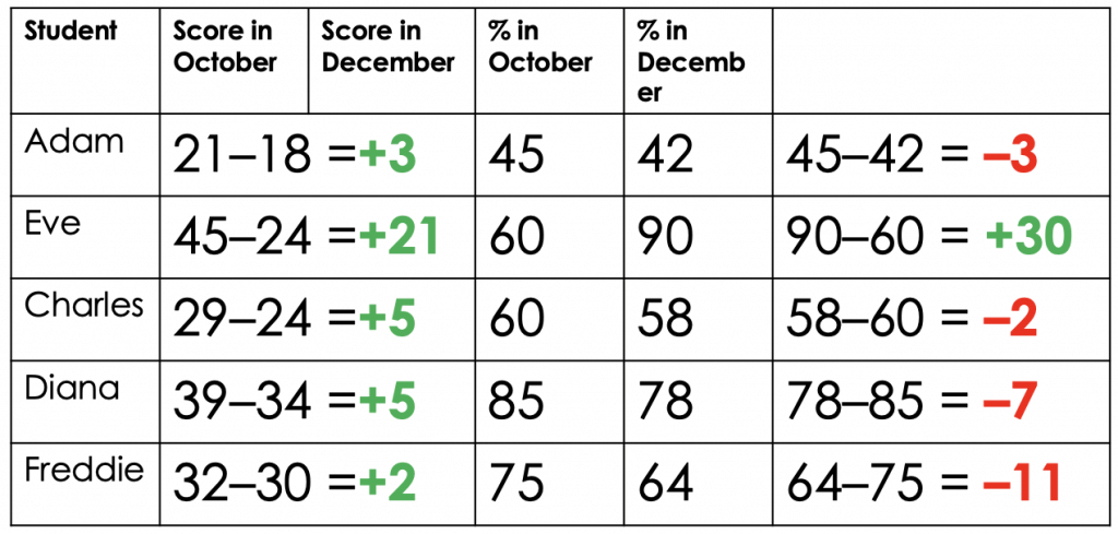 Adapted from Deep Ghatuara's researchEd talk, Fundamental Measurement for Schools[/caption]
Now it looks like only Eve has made progress and that everyone else is in free fall, with Diana and Freddie in need of urgent intervention. If we convert these percentages into standardised scores, things become even more confusing:
[caption id="attachment_67400" align="aligncenter" width="1024"]
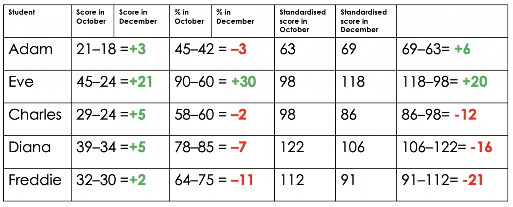 Standardised score: Mean at 100 Standard deviation at 15 (Same sort of scale as IQ) Adapted from Deep Ghatuara's researchEd talk, Fundamental Measurement for Schools[/caption]
Eve is still making great progress, but Adam now seems fine. Freddie is even more of a cause for concern but Charles and Diana aren't doing much better. This illustrates exactly why most school data is garbage. The only meaningful bit - the items students got wrong on a test - is completely lost in our efforts to work out who's on track and who isn't. It's only when we put both assessments on the same scale that subtracting test scores to show progress becomes meaningful. Here is the same data again, this time converted into a fundamental measurement:
[caption id="attachment_67401" align="aligncenter" width="1024"]
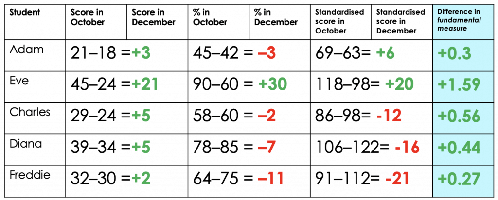 Adapted from Deep Ghatuara's researchEd talk, Fundamental Measurement for Schools[/caption]
Now we can finally see how much actual progress has been made from the first assessment to the second. Eve really is doing brilliantly and everyone else has made some progress. MAybe we should be concerned about the relatively slow pace of progress shown by Freddie and Adam, but, as long as we keep an eye on them over the coming months, there's probably no need for immediate concern.
This all probably sounds fiendishly complex, and to do properly does require some arcane looking equations. Happily, there's some free software you can use to estimate item difficulty and convert assessments onto the same scale. However, the principle is relatively straightforward. What we need to do is to anchor the measurement of students' performance in a second test by including some items from a previous test. So, once you've conducted item level analysis on one test, you need to give some of the those questions with known difficulty levels to students again in the second test. By then comparing how they did on these anchor questions as compared to the new ones, we can get a better sense of the relative difficulty of our second test as compared to our first.
And its the use of anchoring that gives aggregated comparative judgement algorithms like No More Marking their power. In the case of comparative judgement, judges are comparing their subjective view of whether one piece of work is better than another. After a sufficient number of judgements, students' work is placed in a rank order, but behind the scenes it's placed on a scale from, say 5 to -5. Then, if the same students complete a second assessment, pieces from the first judgement session, which already have an established value, are resubmitted for comparison alongside the new pieces. In this way it become possible to make meaningful statements about progress at the level of cohorts and individuals.
You should know that all this merely scratches the surface. If you want to know more I can recommend Trevor Fox and Christine Bond's book Applying the Rasch Model, and I would also point you in the direction of Evidence Based Education's Assessment Lead Programme. Also, you should watch the recording of Deep Ghataura's talk at researchED Haninge:
https://www.youtube.com/watch?v=6MIzK03qeWc&feature=youtu.be
Coda: what about Ofsted?
There's just one final point to make before we turn our thoughts to what teachers should do based on the assessment data they collect, and that's to return to the point made in Part 1 about Ofsted's decision that "inspectors will not look at school’s internal progress and attainment data." I think I understand why they've said this, but I also think they're wrong. Obviously, the overwhelming majority of data collected by schools is worthless and should rightly be condemned. However, what if schools are collecting good quality data and are able to make meaningful and accurate claims and students' attainment and progress? Should this be ignored also? Making a judgement about the quality of a school's curriculum and the education it provides is hard enough but if inspectors deliberately ignore relevant and useful data, the job becomes impossible.
My suggestion is that schools should be allowed, perhaps even encouraged, to explain why they've collected the data they want to show inspectors. They should be able to answer basic questions about how they know it's reliable and accurate and how they've gone about using it to make valid inferences. If a school leader can explain how they have taken action which depended on data analysis which has led to unambiguous benefits for students, then I think we should do them the courtesy of having a look at what that data is. The counterweight to this is to say that if a school presents inspector with anything based on a flight path model then should have their judgement for leadership and management automatically downgraded!
The Learning Spy Substack is a sharp, provocative dispatch from the front lines of education, where ideas are tested, myths are challenged, and nothing is taken for granted.
Join me on Substack